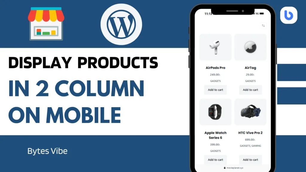
WooCommerce is one of the most powerful eCommerce plugins for WordPress. It makes it easy to create and manage an online store. But when it comes to design, sometimes the default layout doesn’t match your expectations – especially on mobile devices. By default, WooCommerce stacks products in a single column on mobile. While it ensures readability, it can make your store look too long and clunky. If you want to display your WooCommerce products in a two-column layout on mobile view, this guide is for you.
How to Display WooCommerce Products in Two Columns Layout on Mobile View

In this article, we will show you step-by-step how to create a clean and responsive two-column layout for WooCommerce products on mobile screens. Whether you’re using the default Shop page or shortcodes like [products], this method will work seamlessly across your site.
Why Two Columns on Mobile in woocomerce?
Most modern eCommerce websites are optimized to display products in a grid format. On larger screens like desktops or tablets, WooCommerce displays products in multiple columns by default. But on mobile devices, it switches to one column for readability. While this is a good user experience practice, it also means your visitors have to scroll longer to see more products.
Two columns on mobile can make your WooCommerce store look more professional. It also allows visitors to see more options at once, which can lead to better engagement and possibly more sales. Especially if you’re showcasing simple products like gadgets, books, or accessories, a two-column grid on mobile is visually more appealing.
The Problem with Shortcodes
If you are using WooCommerce shortcodes to display products, such as [products limit="8" columns="4"], then you might notice that the layout works fine on desktop but turns into one column on mobile. That’s because WooCommerce shortcodes follow the default responsive grid system, and most themes don’t override it for mobile.
This can be frustrating when you’re trying to build a modern-looking store that stands out. But don’t worry—there’s a simple fix using custom CSS.
How to Display WooCommerce Products in Two Columns on Mobile
To make your product grid display two columns on smaller screens, you only need to add a few lines of CSS to your theme. This method does not require any additional plugins and works with most WordPress themes that support WooCommerce.
First, log in to your WordPress dashboard. Then go to Appearance, click on Customize, and scroll down to the section called Additional CSS.
Now paste the following CSS code:
@media only screen and (max-width: 768px) {
  ul.products {
    display: flex;
    flex-wrap: wrap;
    gap: 4%;
    justify-content: space-between;
  }

  ul.products li.product {
    width: 48% !important;
    margin-right: 0 !important;
    margin-bottom: 20px;
  }
}
Code language: CSS (css)
Once you paste the code, click the Publish button. This CSS targets screen widths up to 768px, which covers most smartphones. It tells WooCommerce to use a flexbox layout and wrap the product items so they sit side-by-side in two columns. Each product is given 48% width so that there’s a little spacing between them.
Does This Work with All Themes?
This CSS works with most WooCommerce-compatible themes like Astra, OceanWP, Blocksy, Kadence, and Hello Elementor. It also works with page builders like Elementor and Gutenberg, as long as the output uses the standard WooCommerce ul.products li.product structure.
However, if your theme uses a different layout structure (like CSS Grid or custom wrappers), then you may need to slightly adjust the CSS selectors. But for the majority of WordPress stores using standard WooCommerce shortcodes, this code works out of the box.
Final Thoughts
Customizing the WooCommerce layout for mobile devices is one of the easiest ways to make your store look modern and user-friendly. A two-column layout helps your customers browse more efficiently and keeps your pages from looking too stretched or empty. Whether you’re building a gadget shop, a fashion store, or a book marketplace, this little design tweak can make a big difference.
You don’t need a plugin or a premium theme to achieve this. Just a few lines of CSS and your WooCommerce product grid will look polished even on small screens. At Bytes Vibe, we always focus on making web development easier and more effective for everyone. So if you’re serious about optimizing your store for mobile visitors, implement this layout today.
Want more tips like this? Stay tuned to Bytes Vibe where we cover everything about WordPress, WooCommerce, SEO, and web design that actually works.


